A better org chart
Each year, millions of people start a new job. the first first thing they will do? Open an org chart.
Org charts are critical document. Functionally, we use it to find & research people. But org charts are so much more than a tool. As all maps do, org charts shape our minds about how the organization works and who you should care about most.
While the world of work changed dramatically, in collaboration, software, services, processes, global footprints and more recently remote work, org charts have note. Search for org charts and you’ll see they have a standard template. For the most part, org charts show a CEO or GM and then layers of people under them. Matrix organizations add some complexity to this, but it’s generally the same picture.
I wanted to explore an org char that more accurately represented my work today.

What would a better org chart look like?
Recently taking a new role, I started to think about the characteristics a modern org chart should have:
It should allow a manager to convey the full scope of his or her organization, creating a simple picture of how a team works
It should show who is responsible for what, allowing employees to see who makes decisions
It should enable accountability, tying names to work
Here’s a recipe to create a new product org chart.
As product are more complex, it’s nearly impossible to divide them top down. Thus, the key learning in my creating a new org chat was to work bottoms-up from how the product works.
Step 1: Draw the system
I started my org chart not by thinking about people, but by thinking about what we’re building.
There are several ways to draw a system diagram (my favorite books are Vehicles and Thinking in Systems), but I used a pretty simple framework. Every product connects the dots between elements into something bigger. Simply draw out the elements.
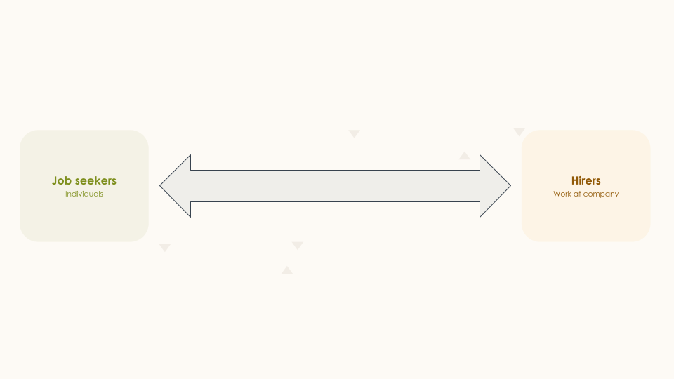
At LinkedIn, one of my products connects jobs seekers to hirers. So i drew those two boxes on a piece of paper. They exchange information when someone applies for a job or sends an inmail, so I connected the box with those lines.
At home, my family has a small business that makes gummy bears. Our system connects five ingredients to make bears. You could draw the ingredients on one side, and the cooking process as lines.
No matter what you are building there is which you connect some input to an output. Write down the items, the draw connection lines. Make sure it fits on one page.
Step 2: Add levers
The purpose of the product organization is to constantly improve the system. There are a finite number of levers in any product that you can actually use to do this. List them out. For example:
At LinkedIn, we can improve the number job seekers and hirers, for example through increasing our advertising spend or more viral loops. We can improve how they connect with better job recommendations, in part by better understanding what people want and what skills they have. There are of course other levers too.
At Better Bears, we can change the ingredients we use or suppliers. We can improve how they connect by changing the manufacturing process, such as introducing new mixing tools or changing the recipe.

Step 3: Assign names and teams levers
The process diagram turns into an organization chart when you start calling out who is accountable for each lever. It’s important to assign names to the levers, as that is ultimately what some is doing.
At LinkedIn, it’s important to know the single person responsible for search. This allows everyone in the organization to know who to find if something feels wrong or a new product with work with search
At the gummy bear factory, we realized a key person responsible for a production step was a supplier contractor. Knowing the criticality of the role, I ended up spending a lot more time on it personally.
In larger organizations, many levers are controlled by multiple functions. A subway like legend shows the team accountable as a whole, allowing people to understand team functions
At LinkedIn, a team designers , engineers and product managers is assigned to improve each lever. Each brings functional expertise to the same problem. As I sat with my design and engineering counterparts to assign names, we realized a huge benefit to this approach was that it created a single org chart across all functions.
Of course there are levels to any system. Any piece of the system diagram can expand into a similar process, showing how her team interacts.

How do you know this is working?
How do you know it works? I made sure I got feedback from the team in three ways
Do you know who is responsible for a decision.
I talked to people at all levels of the organization. I asked them who would you go to solve a problem, how did they think that person would make the decision, etc.
Do new employees ‘get it’
I also sent it to new employees and asked them for questions, the ultimate test on if the diagram worked. Not wanting to actually quiz them, i generally watched how they used the diagram and refereed to the vocabulary in future sections
Can everyone on your team know what they will be measured by at the next review.
Finally, i started to refer to the diagram when asked about career growth. When someone asked how they would get to the next level, i’d pull up the diagram and ask what they think they have to do. I listened to answers to make sure they knew what success was with their lever and how that fit into the bigger system.
11. This is not a radical idea.
Months later, a friend sent me the first org chart ever created: The New York Erie Railroad. It was a work of art, where the HR system (people) were overlaid on the product system (railway), as shown below. The more things change, the more they stay the same.
